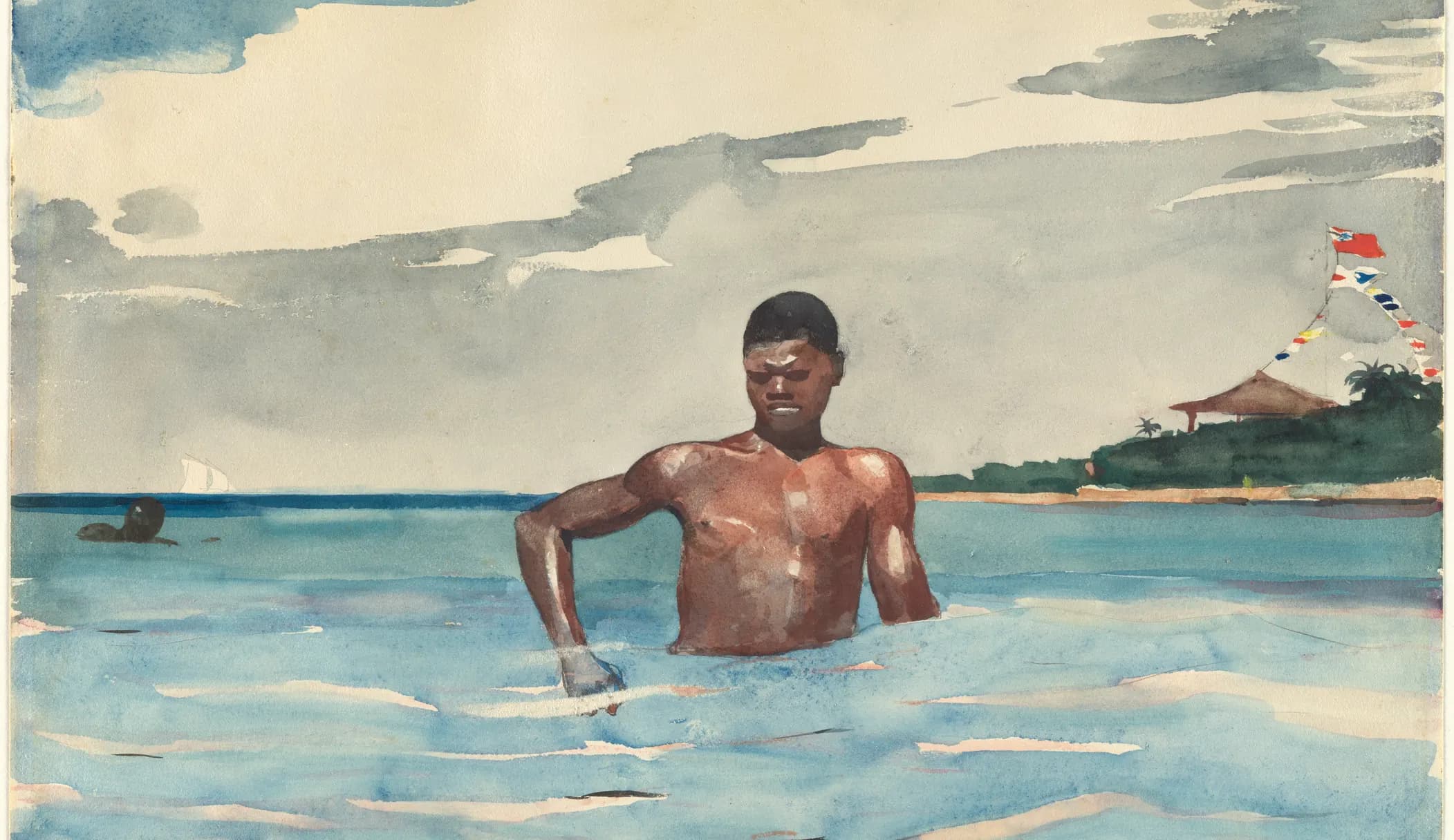
Winslow Homer, The Bather, 1899. The Metropolitan Museum of Art. Public domain.
If you’ve read the guide to light and medium skin tones, you already know the important bit: skin is not a special colour, it’s an orange that’s been quietened, and the paints which reach it are probably already in your set. All of that is still true with darker skin. What changes in that part of the scale is not the colour but the effort. With lighter tones you can sometimes capture them with just one tube. With this set of tones, you very rarely can.
Four faces, three values, three palettes
Four more faces which I sampled the same way: picking a shadow, a mid-tone and a highlight on each. Play with the palette selection to see what those readings become when mixed with a real set of paints.
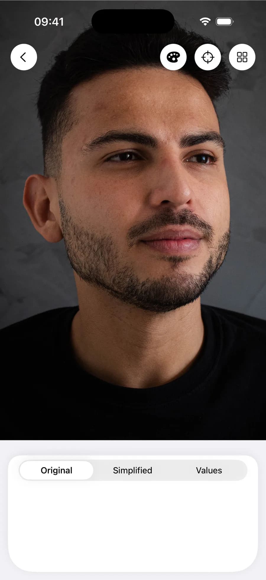
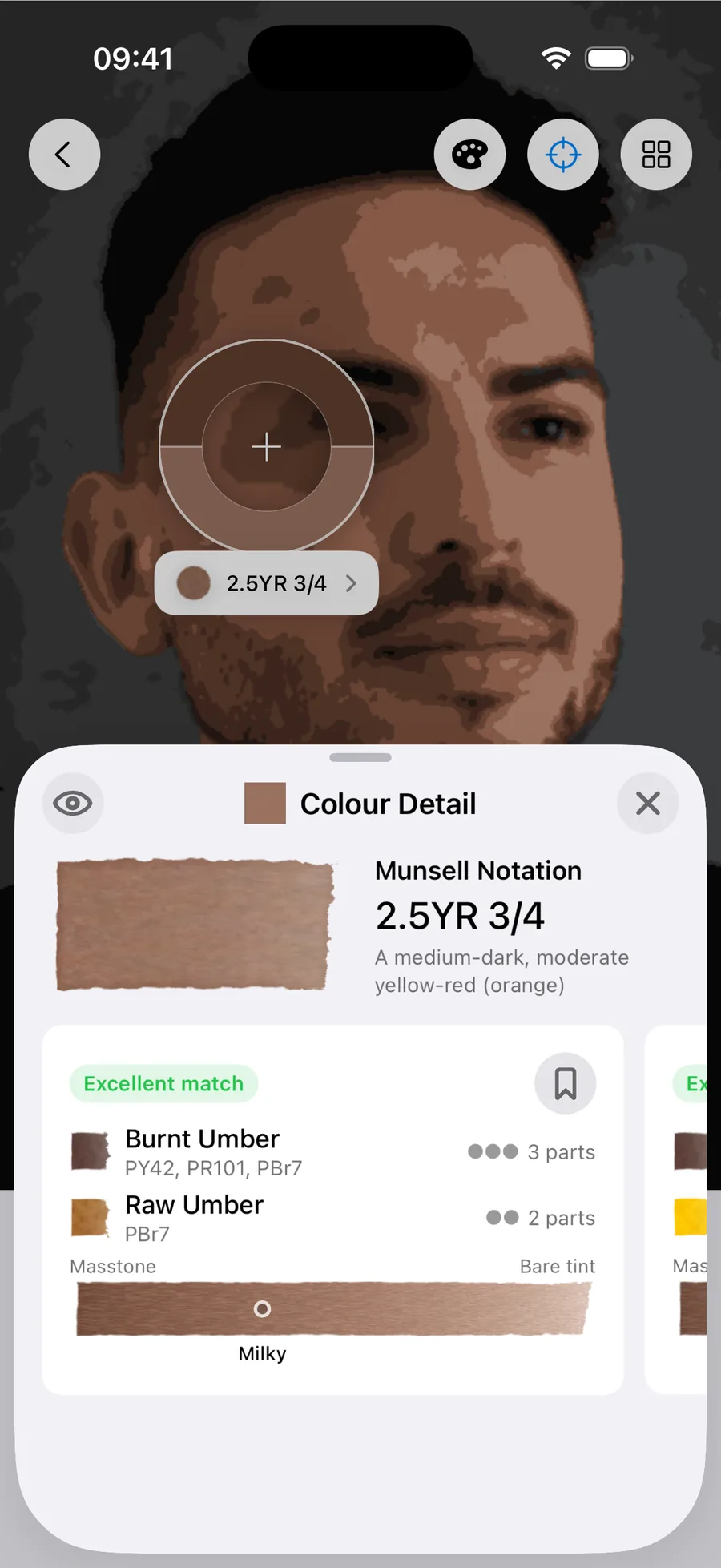
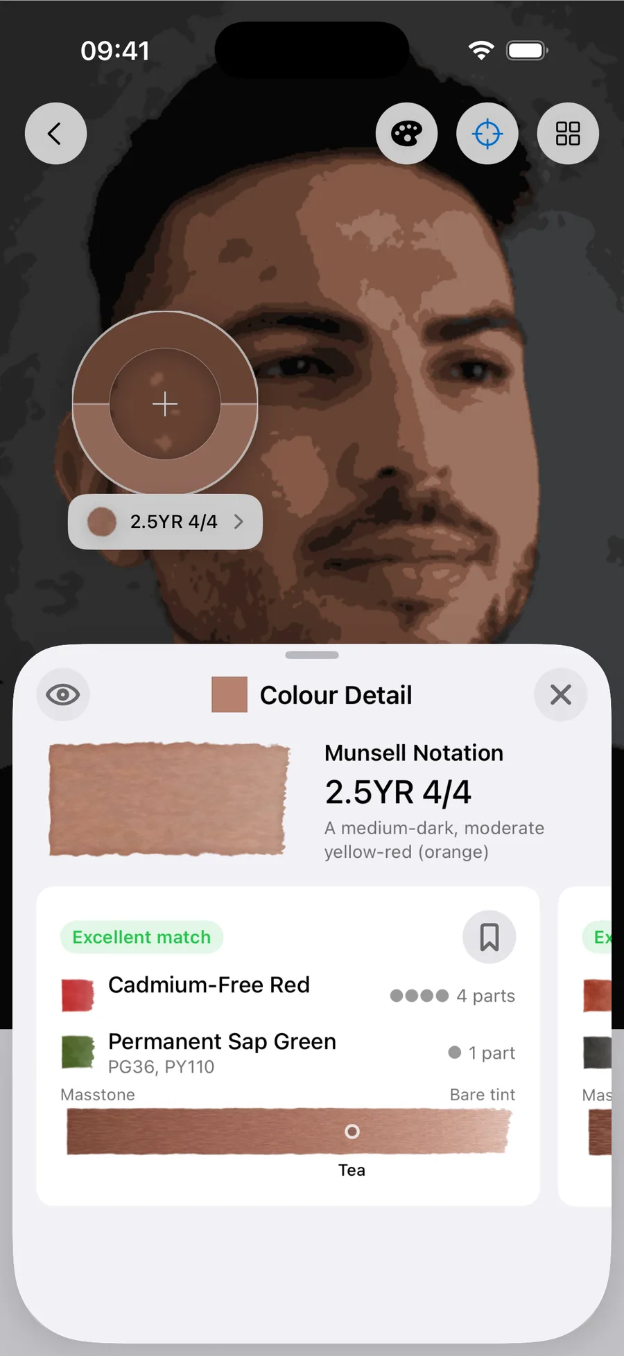
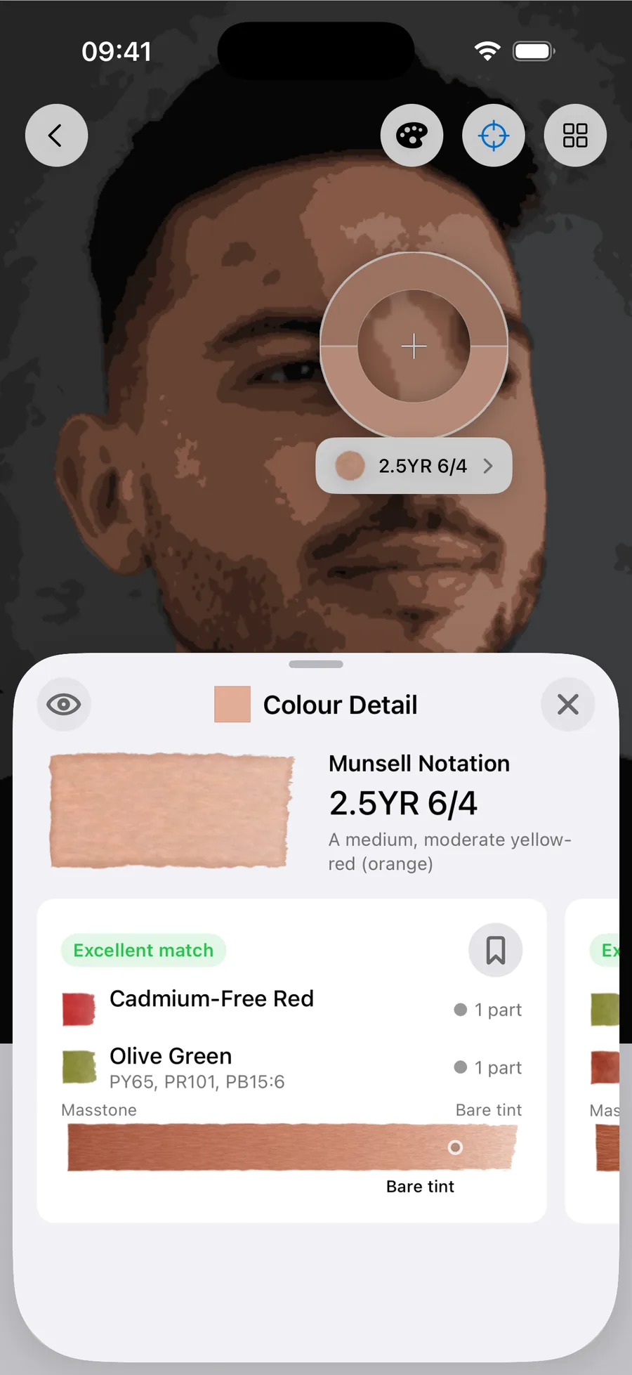
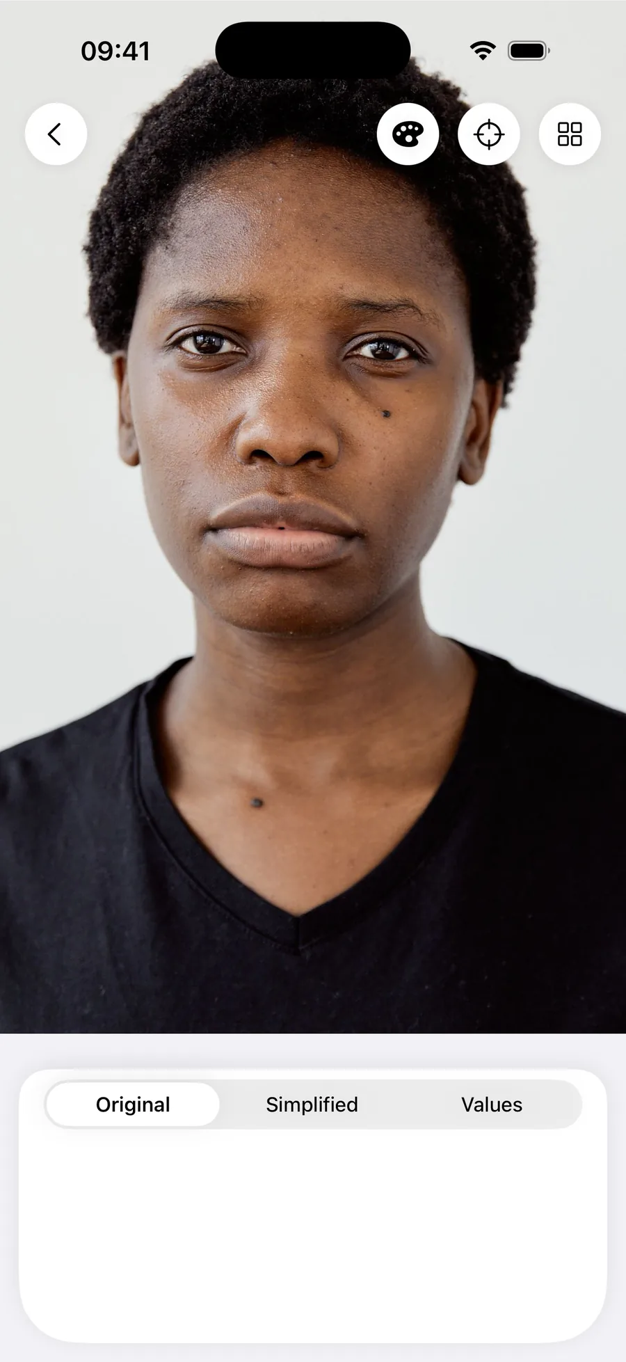
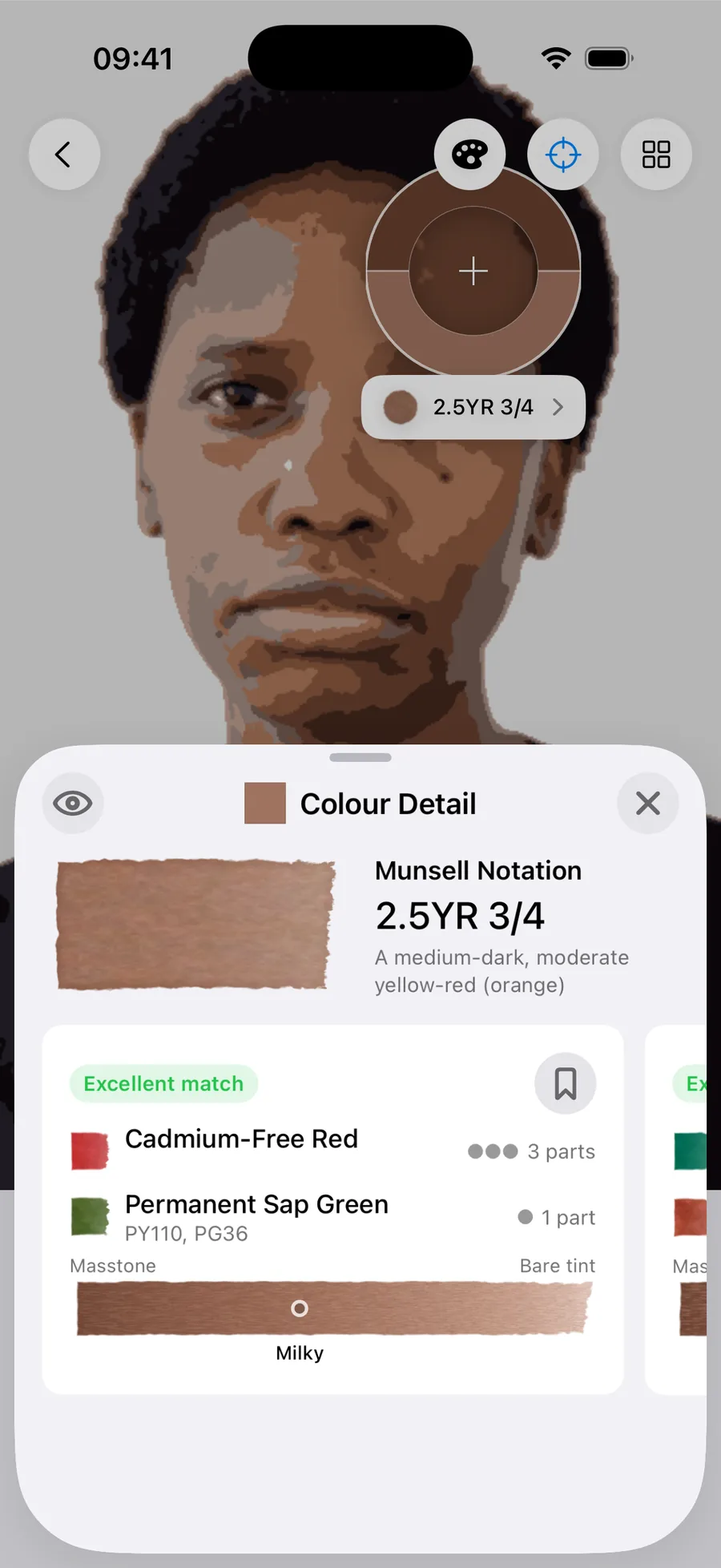
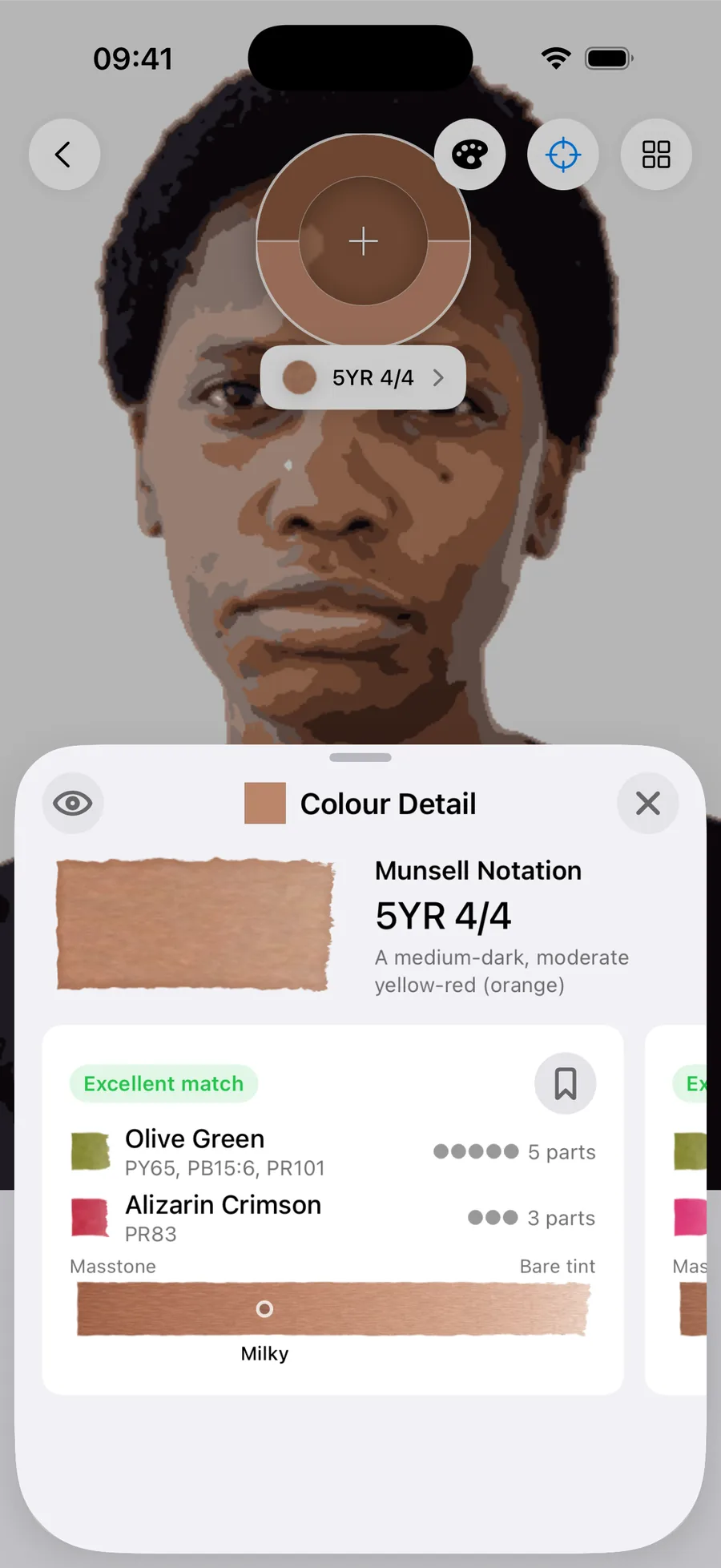
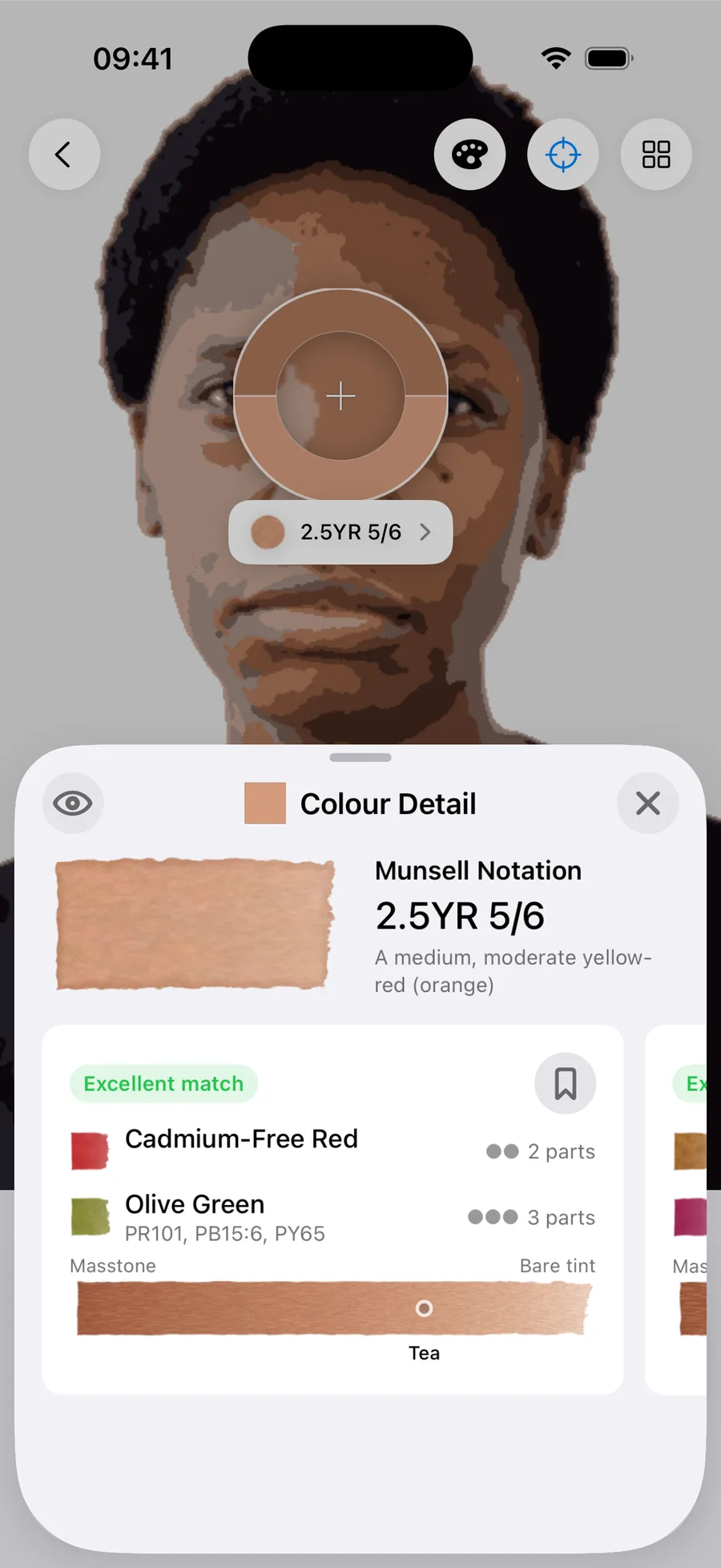

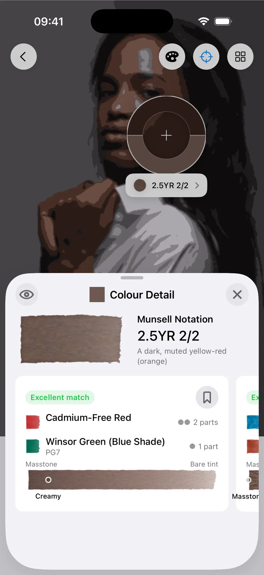
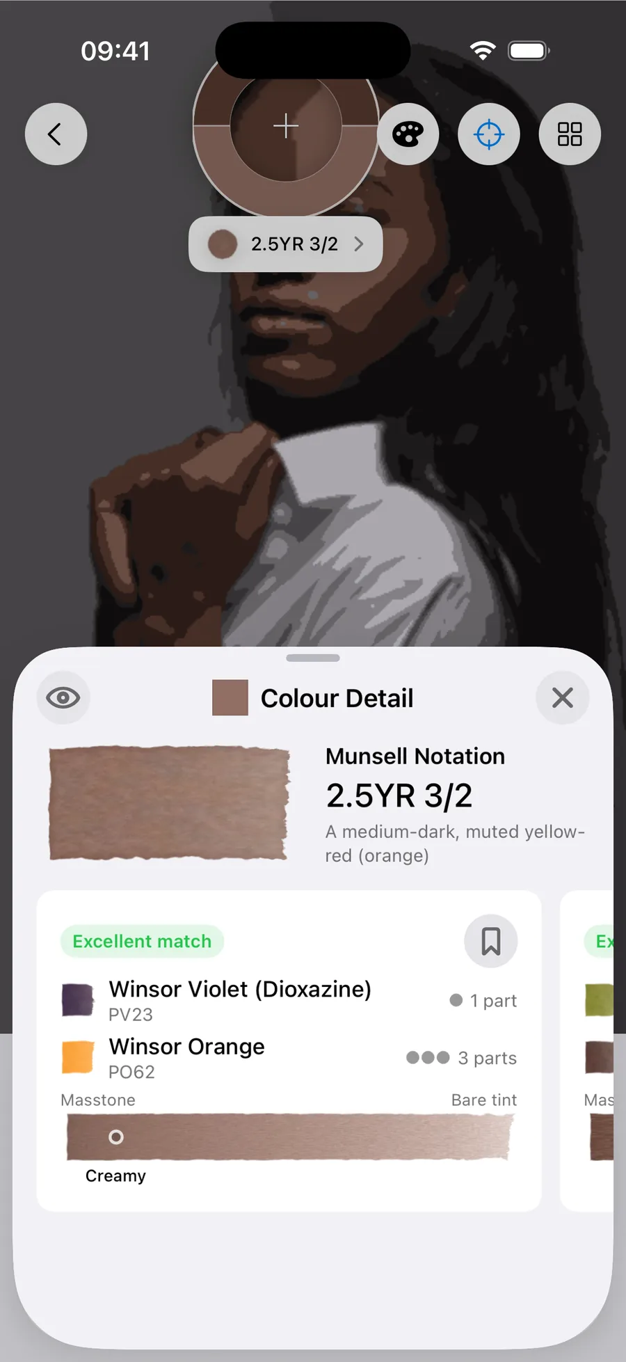
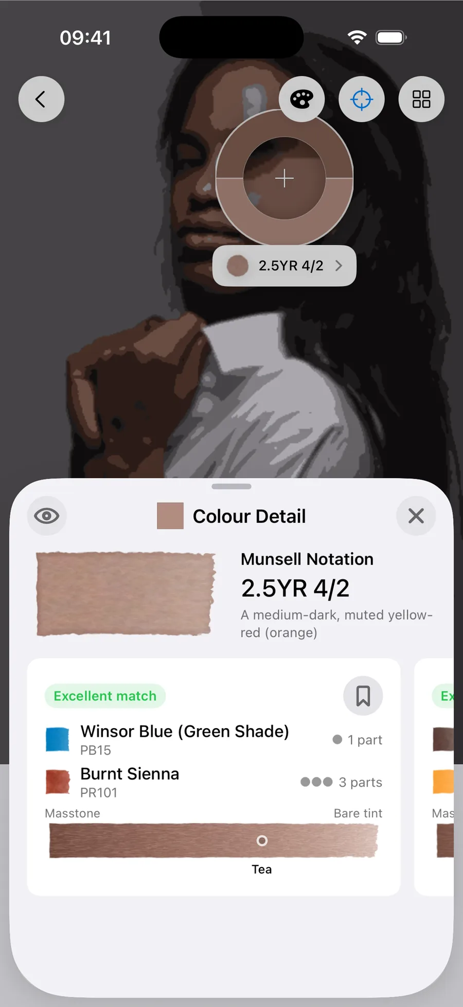
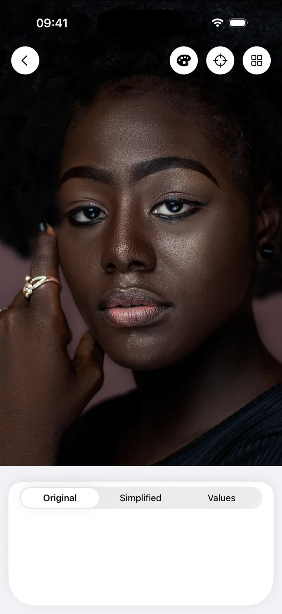
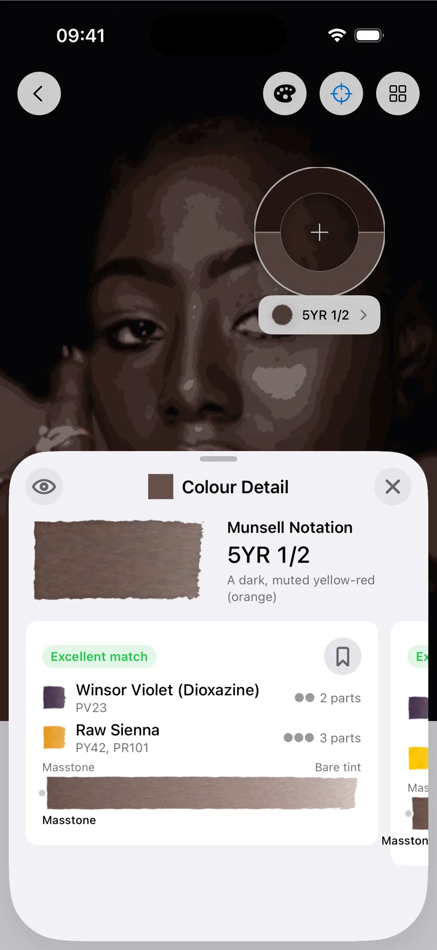
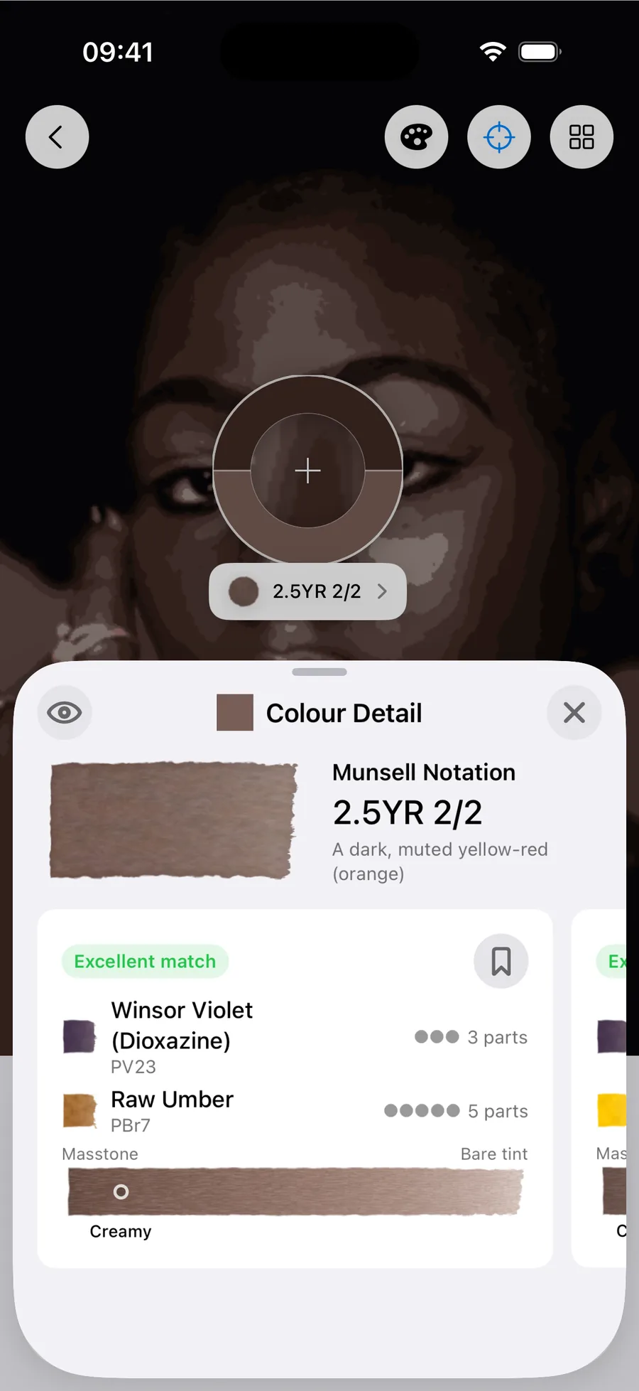
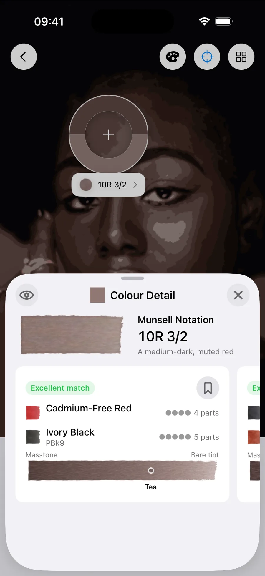
Everything the last guide said about hue is unchanged, sample the skin in any photograph, of anyone, in any light, and the colours land in the same narrow band between red and yellow. Eleven of the twelve readings on this page are yellow-red. The twelfth, the highlight on the face with the deepest skin tone, is a red.
If you look at both guides together, there are twenty-four readings running from the palest tone to the deepest, and all of them sit in the same small family. There’s no point on the scale where one kind of skin stops and another begins. It’s one continuous range, and dark skin is just one end of it.
What you lose first is the shortcut
All the palettes I tested worked well at the darker end of the scale. Every mixing recipe on this page was matched well by all three paint sets, and the faces with the darkest skin had recipes that were excellent matches from all three sets, including the six-paint set. If anything this end was easier: the skin tones that paint sets found more difficult to mix are on the lighter half of the page, not the darker.
What changes is how much paint it takes. Think about what a single tube can actually make. Squeezed out neat it is as dark as it will ever be, and gradually adding water gives a simple gradient on bare paper. That gradient is every colour which that paint can give you, so it is a thin set of choices.
A pale, slightly muted skin tone often sits somewhere on such a gradient, which is why the last guide would sometimes find a recipe using one tube. A dark, muted one rarely sits on one of these gradients. So to capture it you need two paints, which between them sweep out a whole swath of colour rather than a simple gradient. With smaller sets, they may still miss, so you might even need a third paint.
That’s exactly what the measurements show. Not one of the thirty-six recipes here can be mixed from a single paint, where the last guide managed it five times. The six-paint set needed three pigments for every reading on this page, where on lighter tones a third of its recipes managed with two paints or one. You haven’t lost accuracy; these matches are still great. But you have lost the shortcut to that accuracy. If you want to see an interactive visualisation of the colours you can reach by combining two paints from widely available sets, it is in a separate piece on palette mapping.
What the recipes actually reach for
The last guide found an earth in nearly half its recipes, and told you to start there if you own one. That advice doesn’t extend as well as I’d expected. Only a quarter of the recipes here use an earth at all.
But what replaces them is pretty standard. Look down the list and it’s the typical contents of a paint box, used in pairs: a red with a green, a violet with a raw sienna, a burnt sienna with a blue. The face with the deepest skin tone on the page is reached in the twelve-paint pocket set with madder lake deep and viridian, and nothing else.
The last example’s useful. Those two paints from Van Gogh’s Watercolour Pocket Box, in the same five-to-two ratio, make all three values on that face. The shadow is the mix at masstone, the mid-tone is the same mix creamy, the highlight is the same mix milky. One decision about colour, three decisions about dilution.
When the recipe looks wrong
The last guide warned you that a good recipe will sometimes ask for something absurd, and that you should test it before you discount it. With darker tones you can expect that to happen more, not less.
A shadow on the deepest brown asks for a green. A mid-tone asks for a violet with an orange. A highlight asks for a burnt sienna with a blue. Two recipes reach for black, which we will come back to. None of these sound like skin in theory, but all of them are correct on the paper, for the reason the last guide gave: mixing two paints traces a curve through colour space, and the paints that land on a colour are often nowhere near it.
Five ways dark skin tones go wrong
Assuming you need a special colour. There isn’t one. Every tone on this page sits in the same red-to-yellow band as the tones on the light guide, and the recipes use the same kinds of paint. If a mix isn’t working, it’s the value or the number of paints, not the family of colour.
Adding white to make a highlight. Watercolour lightens with water and the paper is your white. The temptation is stronger here because the distance from the mid-tone to the highlight is greater, but white pigment turns the wash chalky and kills the glow that makes skin read as skin. Reserve the highlight instead. Look at the Homer at the top of this page: his brightest marks are bare paper he painted around.
Too many pigments. The same failure as anywhere else. Every extra paint absorbs a little more light, and a mix built from four or five ends up absorbing nearly all of it. Choose two or three deliberately, then commit.
Treating the shadow as an absence. The shadow side of a dark face is a colour, not the mid-tone with something taken out. Mix it as its own colour and the whole head sits in light. One thing worth pointing out from this set is that they behave differently from the lighter end of the scale: on the light guide the shadow measured as the most saturated reading on the head, while on three of these four faces the saturation barely moves between shadow and highlight at all.
Judging the mix wet. Everything dries lighter, and it matters more here, because more of these recipes are mixed strong. A wash that looks right in the well at masstone can dry two steps lighter.
How these recipes were made
Measured the same way as part one: the spectral reflectance of 121 watercolour paints across eight brands on a Nix Spectro 2 spectrophotometer, with mixing predicted by Kubelka–Munk theory, the physics of how pigment layers absorb and scatter light. Recipes generated with Undertint 1.2.
The targets are anchored to the Monk Skin Tone scale, but not to its printed patches. Photographed skin doesn’t sit where those flat anchors do, so bands were assigned by comparison against expert-annotated photographs of real people instead.
The reference photographs are by Claudio Emanuel, Darina Belonogova, Andrea Musto and Shally Imagery, via Pexels.
Questions painters actually ask
What colours do you mix for dark skin in watercolour?
The same kinds you would use anywhere else, and usually just two of them. Across the recipes Undertint suggested, the commonest pairings are a red with a green, a burnt sienna with a blue, and a violet with an earth. If your set has no earths you should build the orange from a red and a yellow and quieten it with a blue, exactly as on lighter skin, except that here you'll likely need all three pigments most of the time rather than sometimes.
Should you use black to paint dark skin?
Sometimes, and the app isn't shy about suggesting it when it's best. Two of the recipes here use one: ivory black with a red for the deepest highlight, and Payne's grey with burnt sienna. Both come back as excellent matches. What black shouldn't be is your method for making a colour darker, because used that way it drains the life out as it goes. As one ingredient among two or three, chosen for the colour the mix actually makes, it is a paint like any other. Worth knowing that the light guide's recipes reach for Payne's grey more often than these do.
Do I need different paints for dark skin?
No. Every paint used on this page would sit comfortably in the boxes the last guide used. The difference is that a single tube can't get you there, and a small set wants three pigments where a larger one wants two.
Why do my dark skin tones look grey or ashy?
Usually because the mix has run out of colour before it has run out of darkness. Every extra pigment absorbs a little more light, so a mix built from four or five paints ends up absorbing nearly all of it.
Why does the highlight matter so much on dark skin?
Because it's carrying most of the form. On a pale face there is not much distance between the lit plane and the paper, so a highlight that is slightly wrong does little harm. On a dark face that distance is large, and the highlight is where the shape of the head becomes legible. Reserve it rather than lifting it, and put it on a plane rather than on the brightest point in your reference: the brightest point is often a reflection of the light source rather than truly lit skin.
The recipe for the skin in your reference
Twelve measured colours and three palettes cover a guide; they don’t cover your reference. Undertint reads the photo you’re using for a painting and works out mixes from the paints in your own set. The value studies and closest single-paint matches are free; Pro finds the exact two- and three-paint mixes, like the ones above. Free on iOS.

Written in British English. If you arrived here searching for dark skin tones in watercolor: same guide, one letter fewer, welcome.