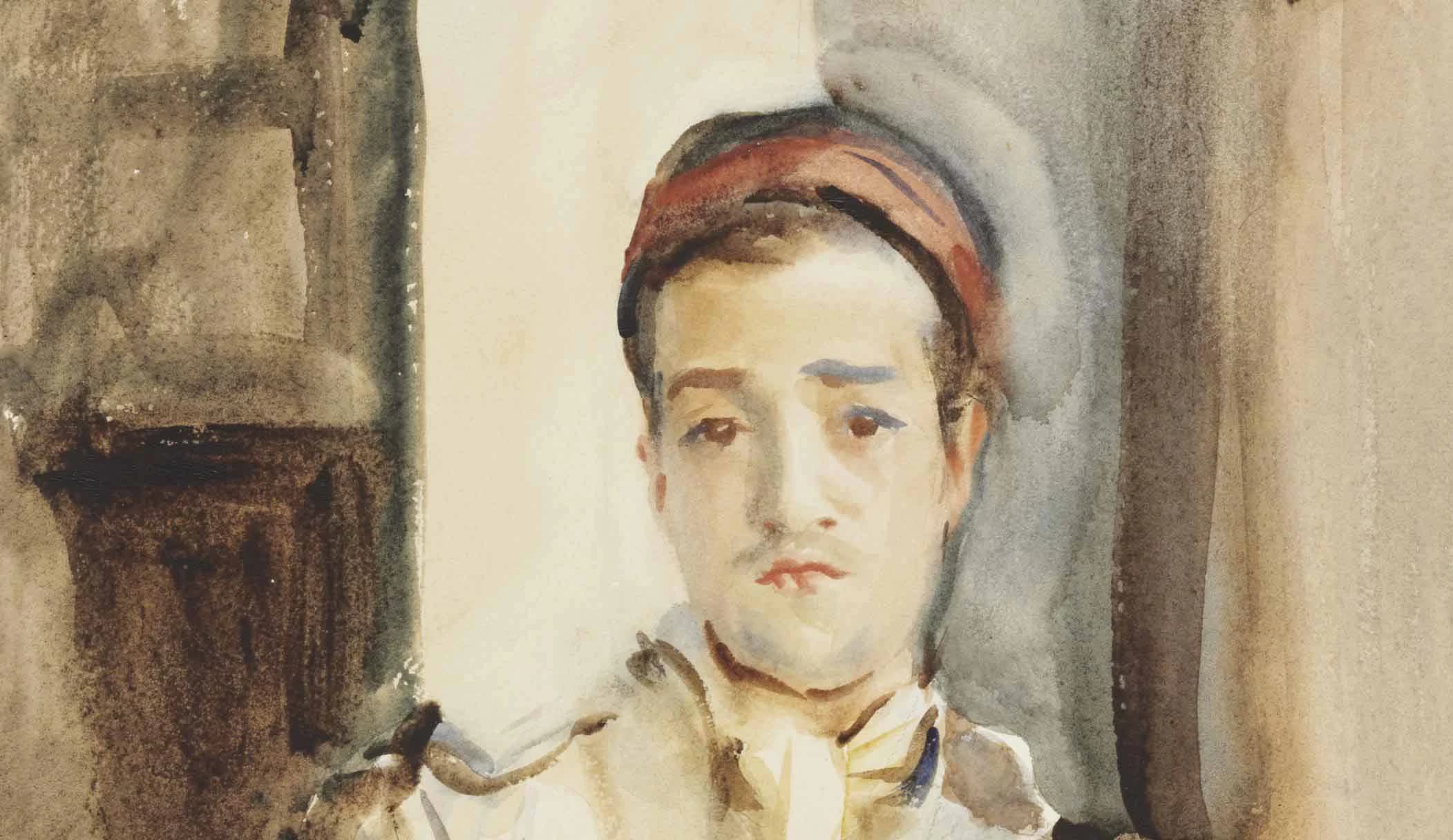
John Singer Sargent, Spanish Convalescent, c. 1903. Watercolour. Public domain.
Skin is the subject that’s most likely to send an improving painter hunting for a tube marked flesh tint, but that tube’s nearly always a disappointment. It doesn’t have to be that way, and it starts with treating the colour of skin as just another colour waiting to be mixed. I’m going to use the Undertint app to show you how to do that. In the first part I’ll look at light to medium skin, and in the second part I’ll look at dark skin.
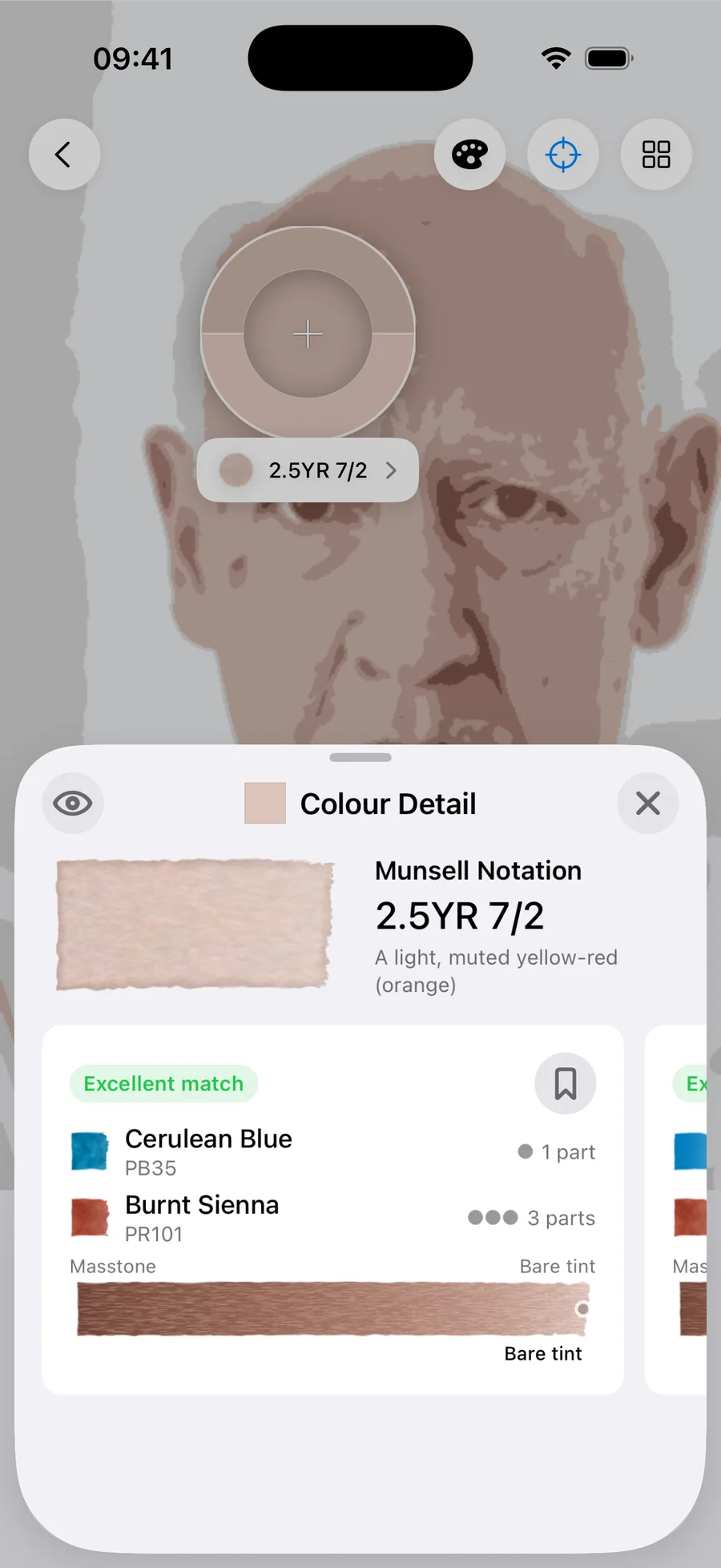
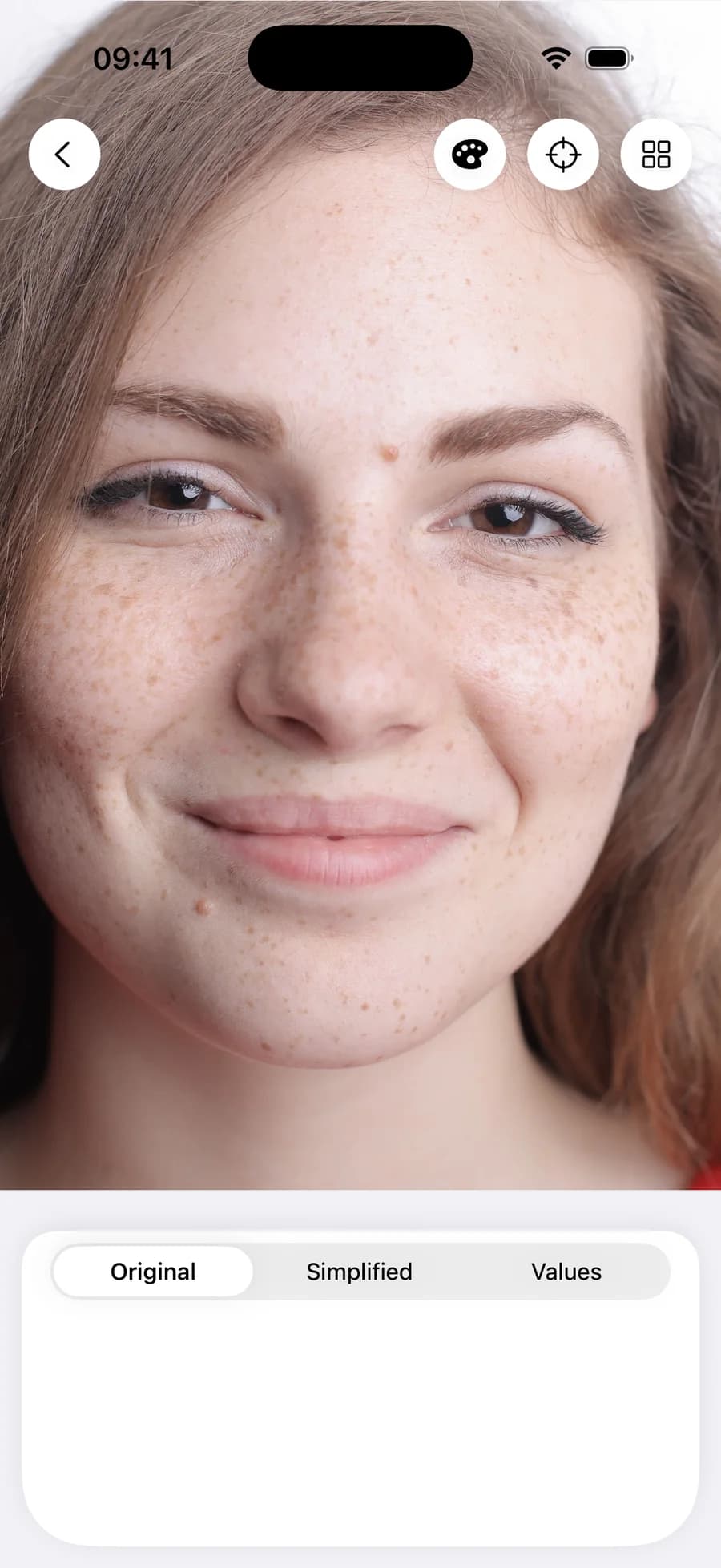
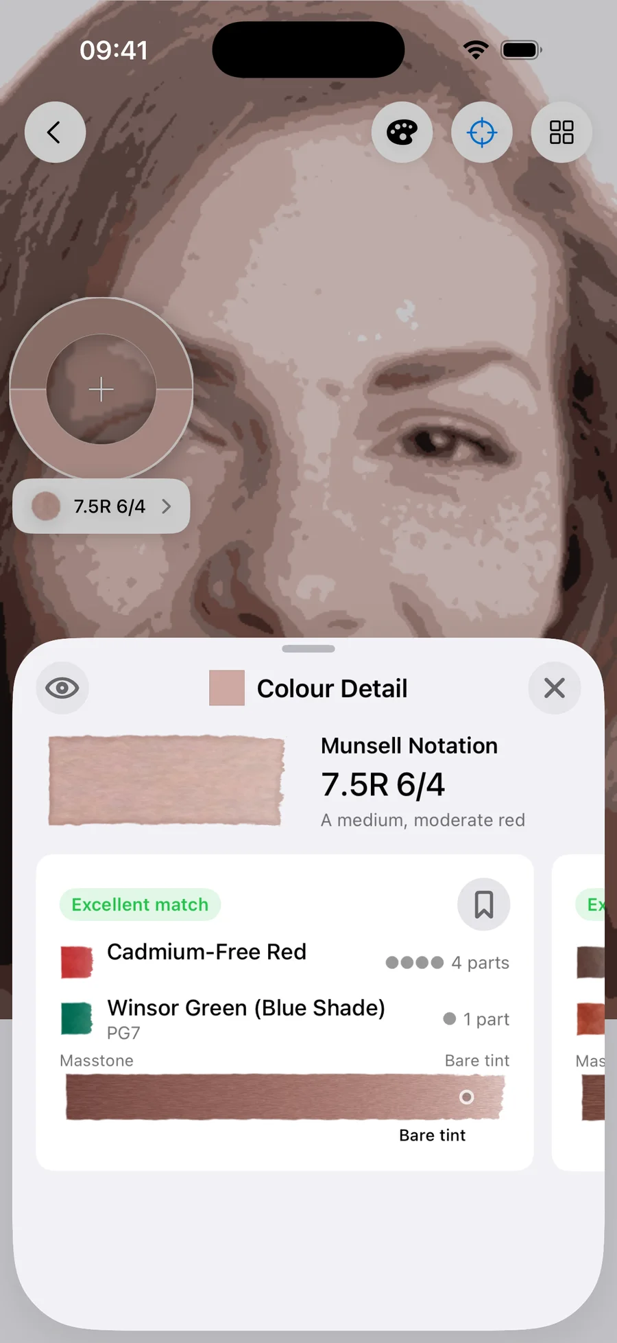
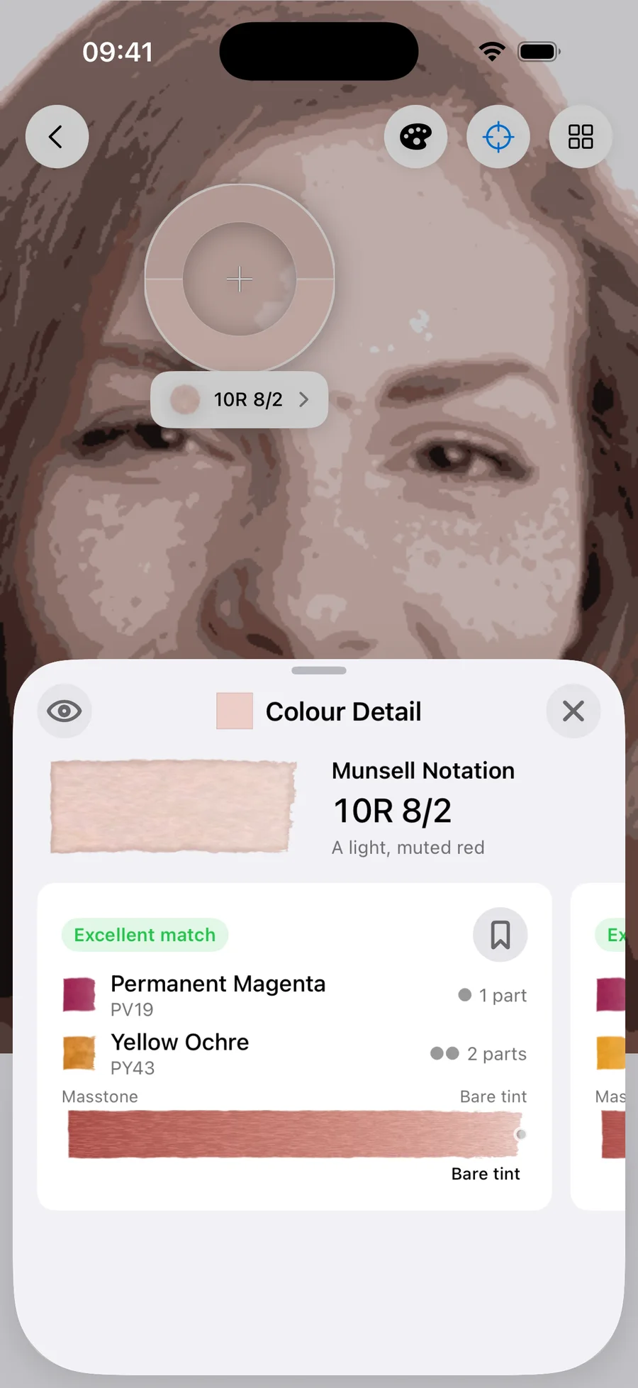
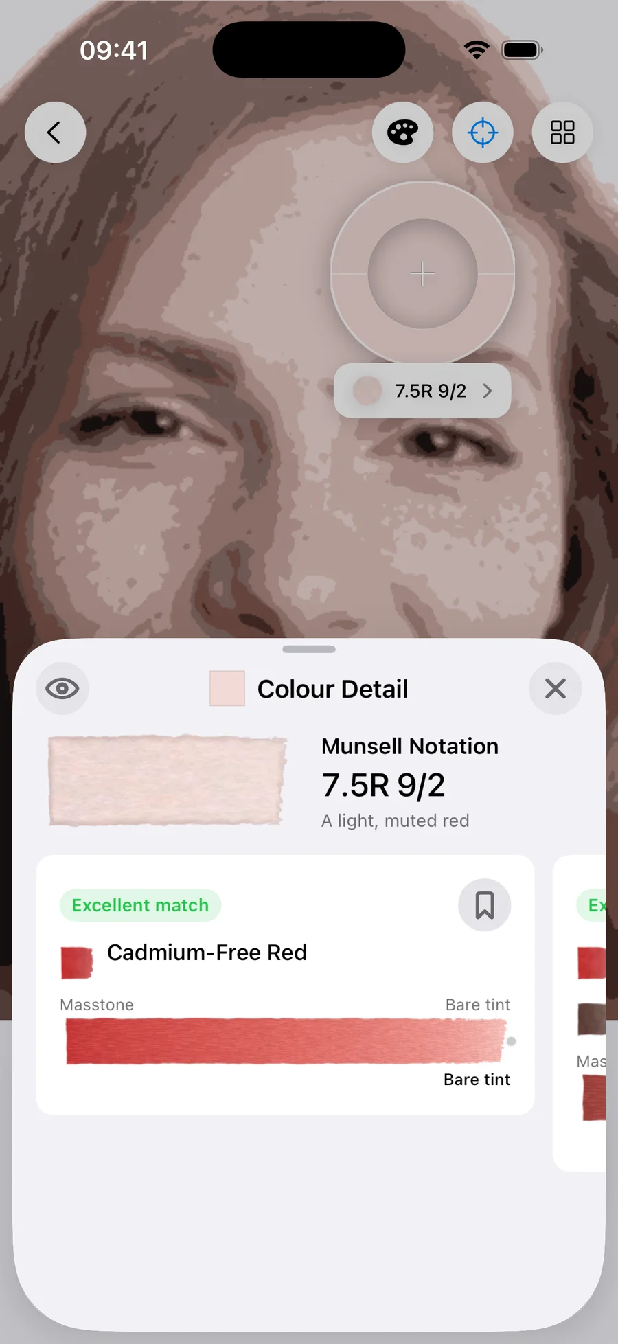
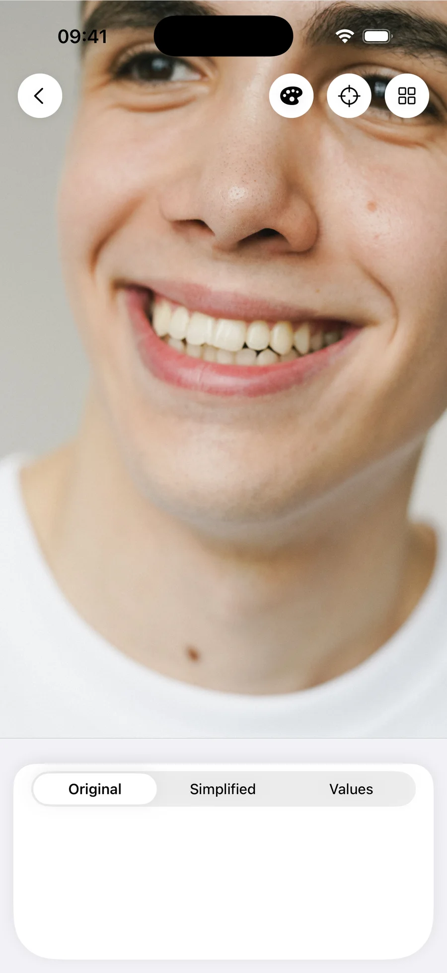
Four faces, three values, three palettes
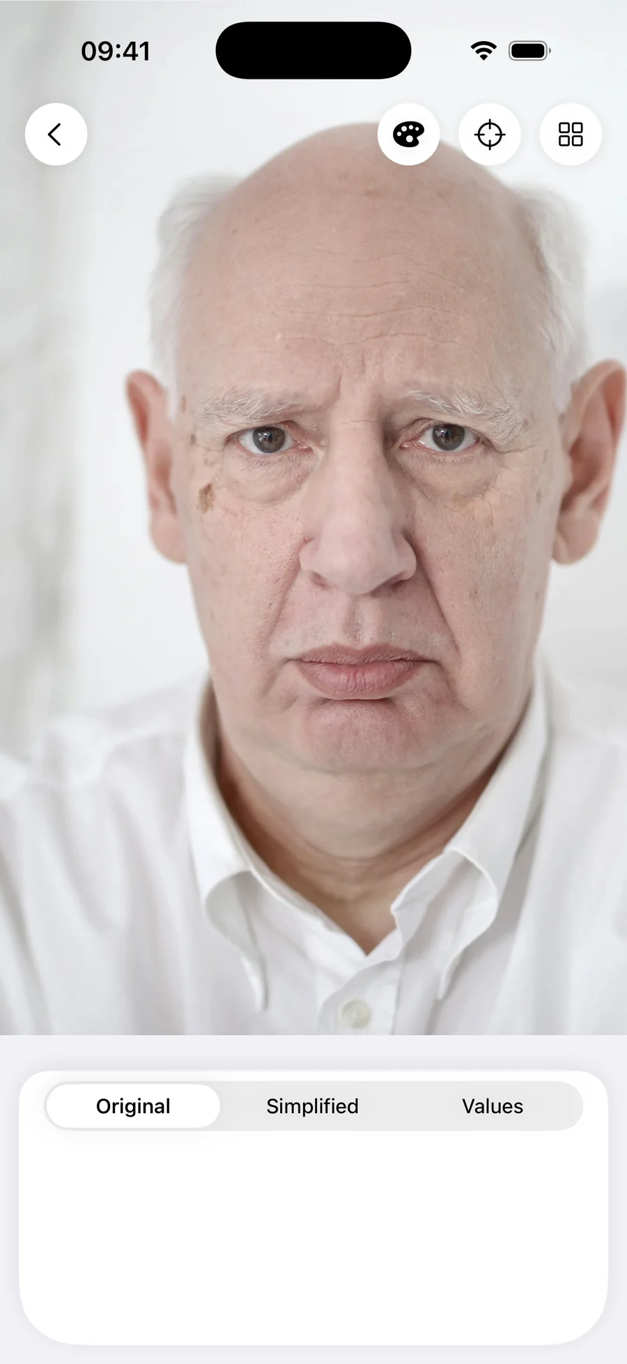
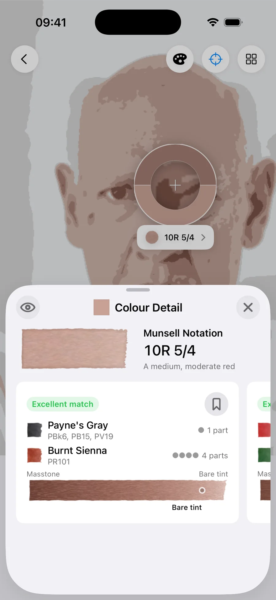
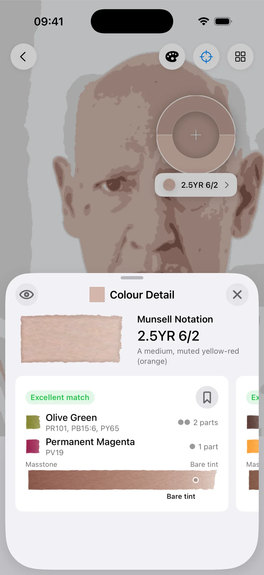
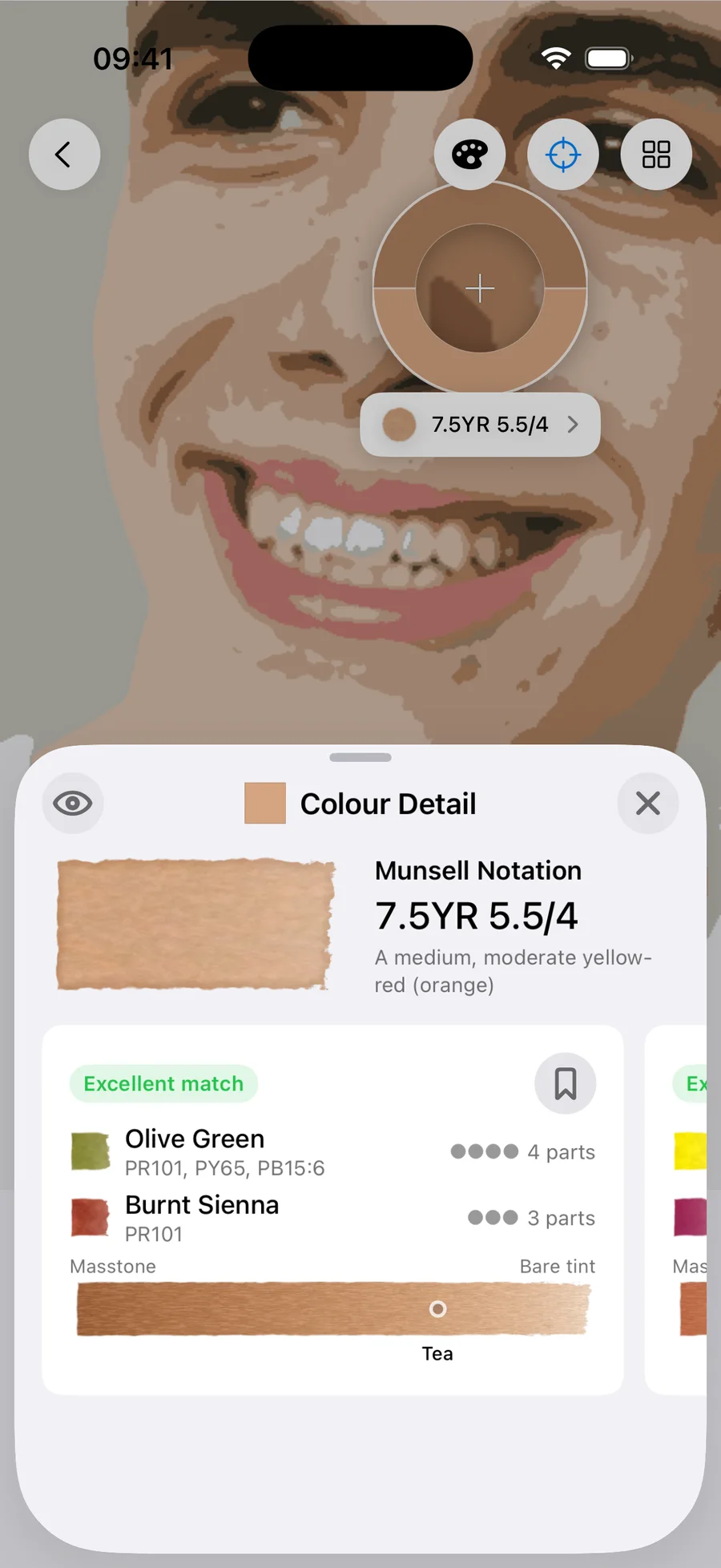
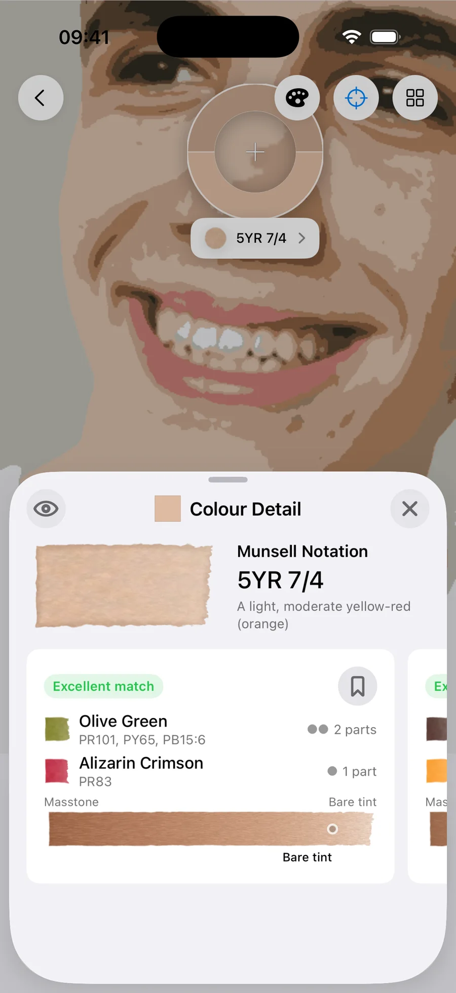
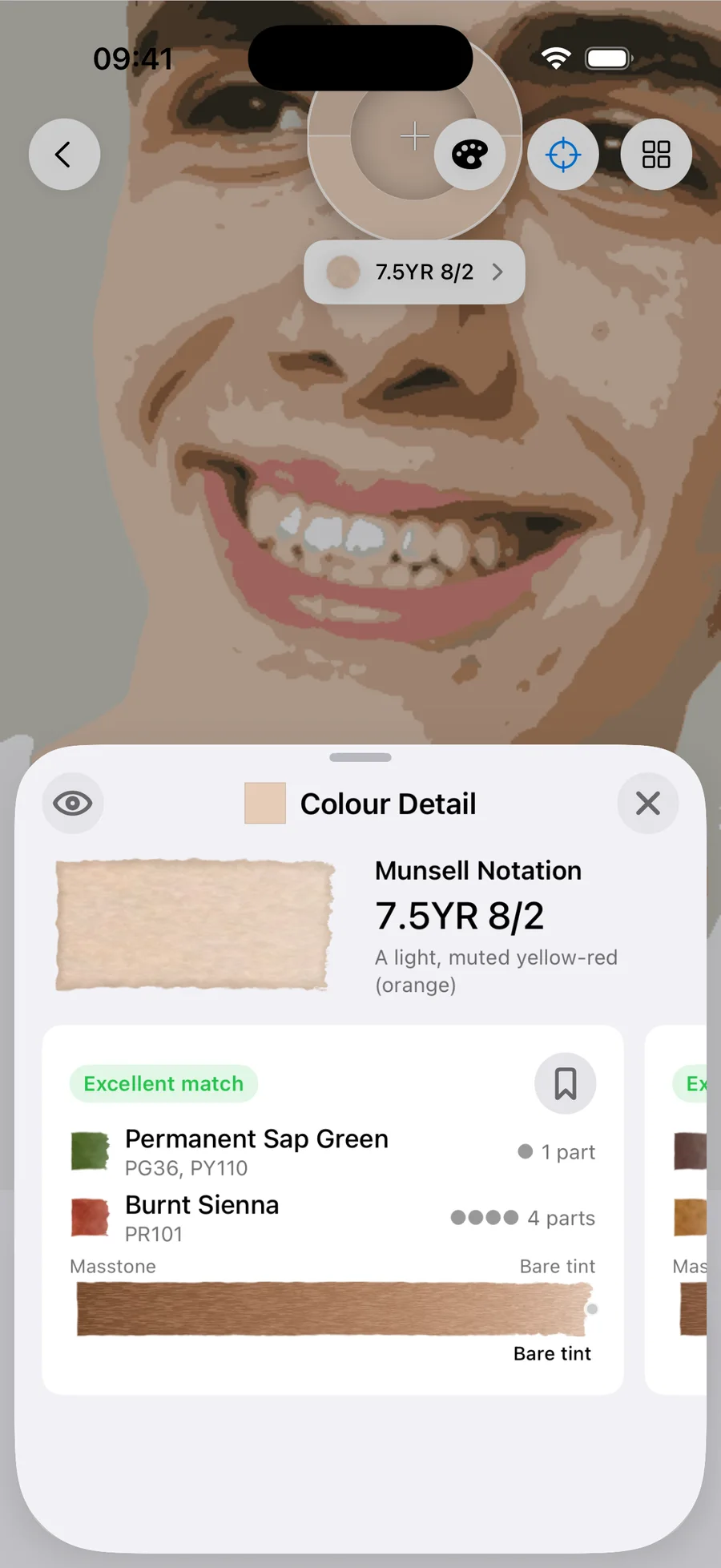
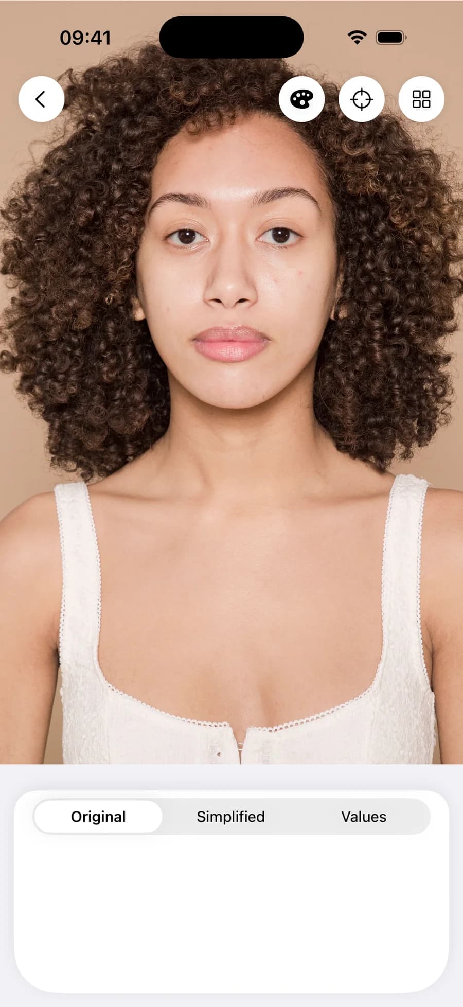
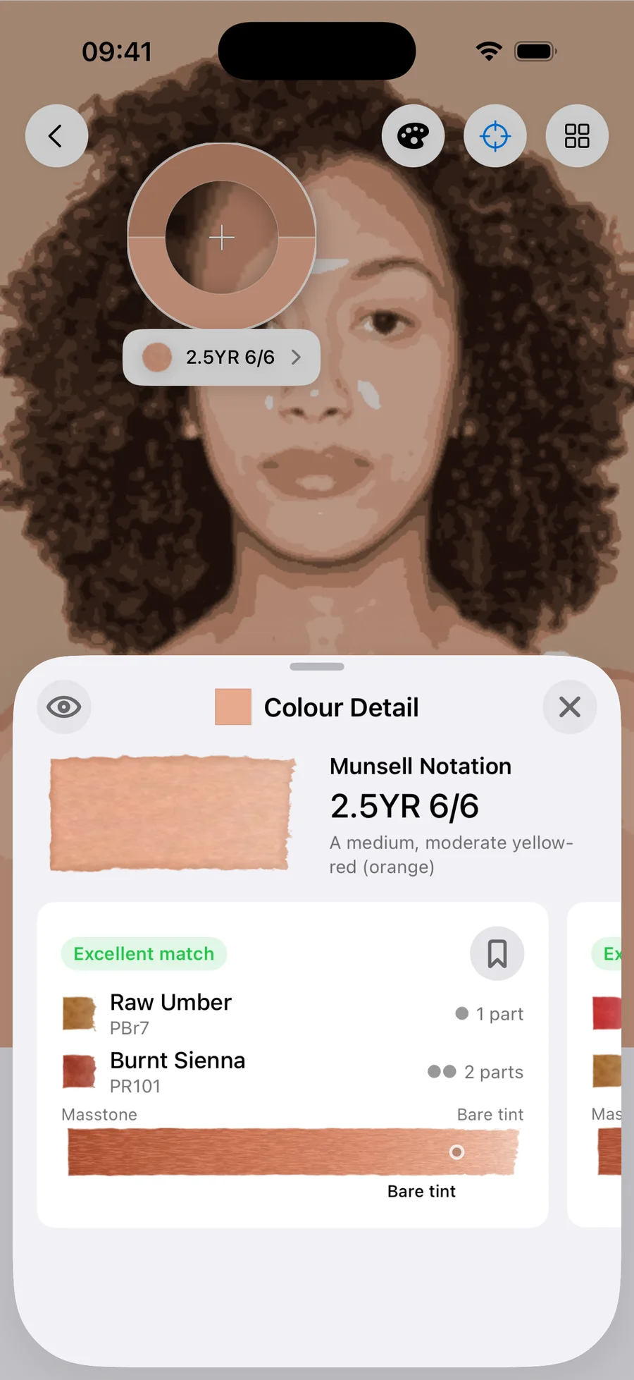
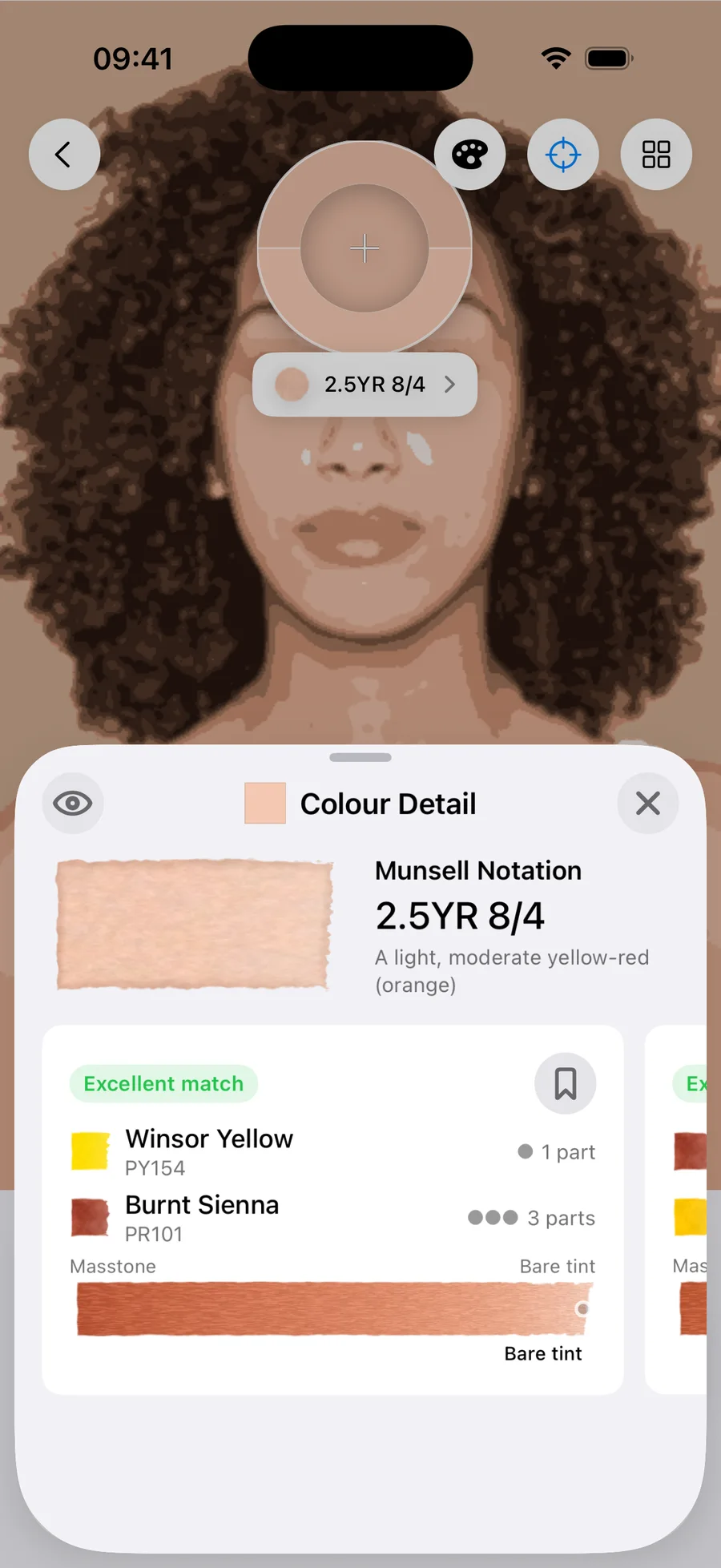
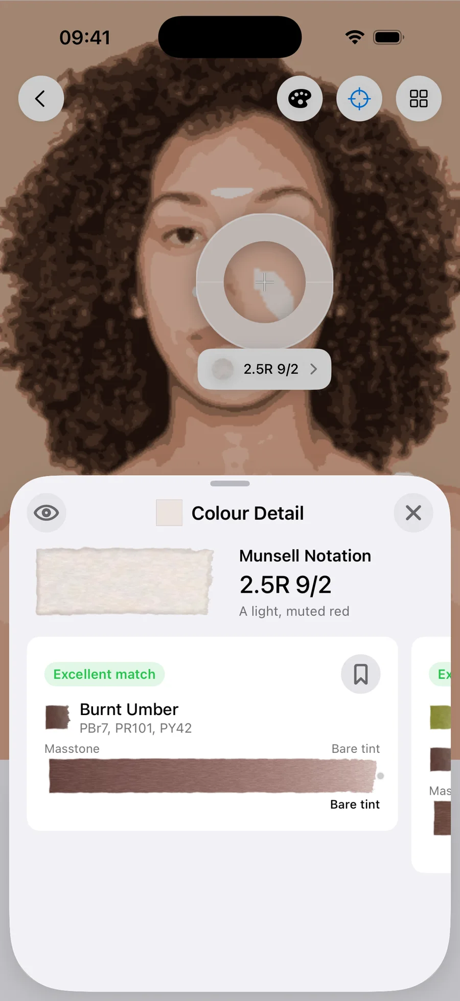
I’ve used four different faces representing four different skin tones. These start with the original image, which I’ve then sampled three times for a shadow, mid-tone and highlight (because skin is never one colour). Play with the palette selection to see what those readings become when mixed with a real set of paints.
There is no skin colour
Sample the skin in any photograph, any complexion, any light, and the colours cluster into a narrow band of hue: the oranges, sitting between red and yellow. In Munsell terms nearly everything lands in YR. What separates one complexion from another is rarely hue, it’s value (how light or dark) and chroma (how muted or vivid). Dark skin isn’t a different colour from fair skin; it’s the same small family of hues at lower value. And the undertone you hear people talk about, warm or cool, is a small lean within that band: towards gold, or towards rose.
If you take anything from this guide, take this. You aren’t searching for an exotic pigment. You’re just placing an orange precisely. How light, how muted, leaning which way.
Get the value right and the colour will forgive you
A portrait with accurate values and slightly-off colour still reads as a likeness. A portrait with beautiful colour and wrong values will read as a mask. Our eyes judge light before they judge hue, so before you start mixing, squint at the reference until you see a few flat tones and note where the lights and darks really fall. They’re probably not where you assume. (Incidentally, this step is what value studies give you, and it’s the part of Undertint that’s free: notan through to seven-band value breakdowns of any reference photo you like.)
Watercolour’s forgiving here. You set value with water, not with paint, so one good mix covers highlight to mid-tone depending on how far you dilute it. One tube of paint is effectively a range of colours, not a single colour, and skin uses that range more than many subjects.
The base is orange, tamed
Every skin tone on this page is an orange which has been quietened. Real skin is greyer than you might think, sometimes dramatically so: the trick is getting that mute right without losing vitality. Add the complement, usually a blue, and the mix greys off while staying alive.
But look at what recipes Undertint actually suggests. It’s two paints, most of the time, and an earth in nearly half of them: Burnt Sienna (PR101), Yellow Ochre (PY43), Raw Umber (PBr7). Count only the two boxes that own earths and it is two-thirds.
Ochres and earth reds have been the base of flesh painting for about as long as people have painted flesh, and the traditional portrait triad is an ochre, an earth red and a blue. If you want the proper account of what the earths are and how they behave, Jane Blundell’s survey of them is a great reference.
If your set has no earths in it, you’ll have to build one: a red and a yellow to make the orange, then a blue to knock it back. As you can see from the Daniel Smith set, it works perfectly well. It just costs you another pigment, so be careful about things getting muddy.
When the recipe looks wrong
Sooner or later a good recipe will ask for something absurd: a touch of green in a cheek, a violet in a shadow. Trust it long enough to test it, you might find you’re pleasantly surprised, too. It’s counterintuitive because the path describing the mix of two paints isn’t a straight line, it curves through colour space which is three dimensional, so the paints that reach a particular colour are often nowhere near that colour. It’s not rare either: more than half the mixes on this page contain a green or a blue: olive, sap, cerulean, phthalo, Payne’s grey. If you want to go deeper on this, I’ve mapped it properly, with interactive tools, in a separate piece on palette mapping. The short version is to judge a recipe by its swatch, not its ingredient list.
Six ways skin tones go muddy
The flesh-tint tube. It’s one fixed answer to a question with as many answers as there are people and kinds of light. It also teaches nothing, and skin is the subject that most rewards learning to see.
White paint. Watercolour lightens with water; the paper is your white. Adding white pigment turns the wash chalky and opaque, and the glow that makes skin read as skin comes from light passing through the wash and bouncing off the paper.
Too many pigments. Mud is rarely the wrong pigments, it’s often simply too many of them, each adding its own absorptions until the mix swallows nearly everything. Three is almost always enough.
Grey shadows. The shadow side of a face isn’t grey, it’s a colour. Mix it as one and the whole head starts to sit in light. Measured across these four faces it is the most chromatic reading on the head. It’s more saturated than the lit mid-tone, not less.
Choosing the mix but not the water. A recipe isn’t finished until you’ve decided the dilution. The same mix is a shadow at tea-strength and a highlight in bare tint, and most wrong-looking skin is the right mix at the wrong strength.
A palette that has to work harder. Switch between the paint sets above. The readings don’t move, because they belong to the face, but the recipes underneath change completely, because a mixing recipe belongs to a colour and a set of paints. Watch Undertint’s match quality as you switch: four of the thirty-six recipes come back good rather than excellent, and three of those four are in the six-paint set, which holds no earths. A smaller box doesn’t put these colours out of reach. It just makes you spend more pigments getting there.
How these recipes were made
I measured the spectral reflectance of 121 watercolour paints across eight brands on a Nix Spectro 2 spectrophotometer. Mixing is predicted with Kubelka–Munk theory, the physics of how pigment layers absorb and scatter light.
The skin tone targets are anchored to the Monk Skin Tone scale, but not to its printed patches. Photographed skin doesn’t sit where those flat anchors do, so bands were assigned by comparison against expert-annotated photographs of real people instead. Recipes generated with Undertint 1.2.
The reference photographs are by Andrea Piacquadio, SHVETS production and Michelle Leman, via Pexels.
Questions painters actually ask
What colours do you mix to make skin tone in watercolour?
It depends what's in your box. If you have an earth such as Burnt Sienna, Yellow Ochre, Raw Umber then start there. Without an earth you build the orange yourself, a red and a yellow, then quieten it with a blue. That works too; it just takes three pigments instead of two, and three is where it can start to get a bit muddy. Value and dilution do the rest, the same mix covers highlight to mid-tone at different strengths of wash.
Can I mix every skin tone from a limited palette?
Most light-to-medium tones, yes, comfortably, and that is the range this guide covers. Darker tones are not a different problem, but they do cost you more paint. Nothing in the darker half of the scale can be matched with a single tube, where several tones on this page can, and the smallest set needs a third pigment every time. The companion guide picks the scale up where this one leaves off.
Why do my skin tones turn muddy?
Usually too many pigments, not the wrong ones. Every extra paint in a mix adds another set of absorptions, and past three the mix starts absorbing nearly everything, which reads as mud. Overworking wet paint on the paper muddies things the same way.
Why do skin tones dry lighter than they looked when wet?
All watercolour dries lighter as the water leaves and the pigment settles into the paper. Judge your mixes dry, never wet, and err a step stronger than looks right in the palette well. A dilution test strip on scrap paper saves a lot of repainting.
The recipe for the skin in your reference
Twelve measured colours and three palettes cover a guide; they don’t cover your reference. Undertint reads the photo you’re actually painting and works out mixes from the paints you actually own. The value studies and closest single-paint matches are free; Pro finds the exact two- and three-paint mixes, like the ones above. Free on iOS.

Written in British English. If you arrived here searching for watercolor skin tones: same guide, one letter fewer, welcome.